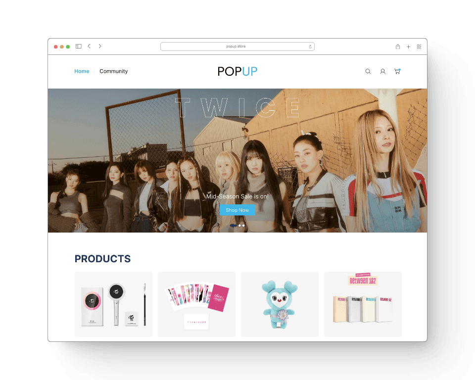
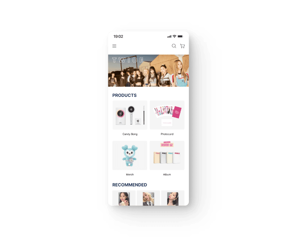
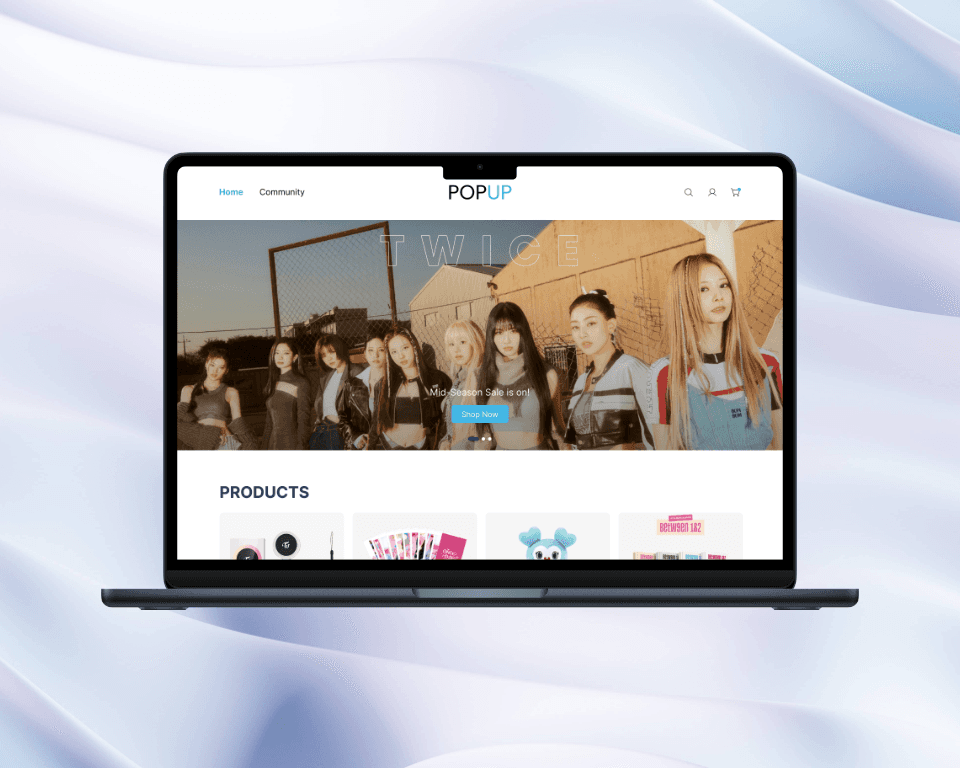
Popup
Product Designer
Portfolio
Persona
Product Designer
Insights
Product Designer
Sketches
Product Designer
Usability study & insights
Product Designer
the final product
Product Designer
reflection
Product Designer
Overview
Product Designer

Saira Lampano
Sep to Oct 2022
🚩 PROBLEM
The available shopping websites have overwhelming layouts, a confusing checkout process, hard-to-find products, and unreliable vendors.
💡 SOLUTION
Create a user-friendly e-commerce website with simple navigation, quick product searches, and a quick payment procedure.
⚙️ DESIGN PROCESS
🔍 USER RESEARCH & COMPETITIVE ANALYSIS
This user group confirmed initial assumptions about PopUp’s customers, but research also revealed that finding the trusted seller was not the only factor preventing users from purchasing K-Pop merch. Other user issues included overwhelming sites, selling of merchandise per set, unresponsive sellers, and use of two or more online selling platforms for transactions.
Saira Lampano
Sep to Oct 2022
🧐 INSIGHT 1
Community for interested topics
Users seek out artists in which they are primarily interested and engage in conversation about them. Additionally, they desire artist-specific filtering that will make it simple for them to locate the goods they seek.
Result: Allow users to select the artists they are most interested in to narrow down the results.
🧐 INSIGHT 2
Selling photo cards per set
Users prefer to purchase individual photocards over sets. This forces the user to either purchase the entire set or find someone else who desires to purchase a photocard from the set.
Result: The website shows the desired products sold in sets or individually.
🧐 INSIGHT 3
The use of two platforms in purchasing
Users must use two platforms for their social media buy and sell purchases in order to: 1. Buying and placing orders 2. for shipping
Result: Use the website to conveniently order and receive products.
Other Works
Product Designer
Mobile and Web


Saira Lampano
Sep to Oct 2022
These are the results of a usability test done on the prototype’s initial iteration including the modifications that were made

Users want to have a selection of interested artists to filter the product recommendations and community topics.
Since there was no option to choose an artist during the initial usability testing, I included it to benefit users in sorting through their preferences and desired products.

Users want an edit quantity feature.
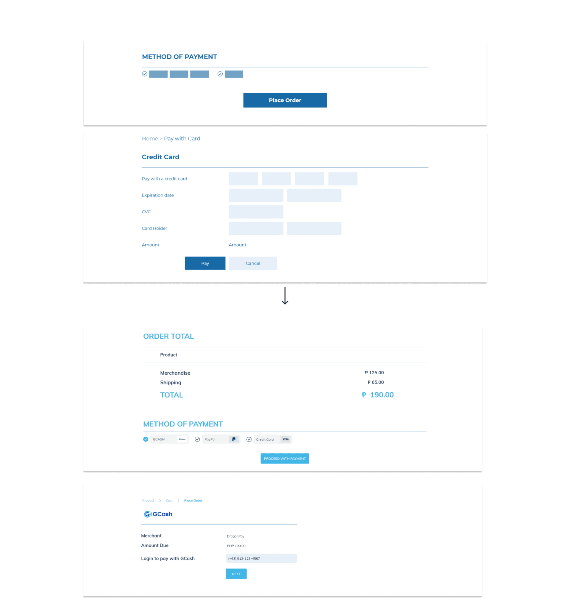
Users want to have other payment modes.
Since clients couldn’t see the payment methods during the initial usability testing, I included the most popular and convenient payment options.

Users want to see the profile information first rather than the order history when clicking the account.
In the initial usability test, participants weren’t sure if they were already on the account page because the account page displays orders before account information.
Saira Lampano
Sep to Oct 2022
Our intended audience praised the design for being simple to navigate, visually appealing, and more engaging. Users of the website seem to find their needs are being satisfied, and it is easy to use.
🧠 WHAT I LEARNED
While designing the website, I discovered that the first notions for the app are really the beginning of the process. Enhancing designs that I wasn’t aware were necessary for the iteration is made easier by peer comments and usability research. I was able to identify fresh ideas and solutions that I had not before considered thanks to usability studies.
Finding people who are suitable for my target was the challenge I ran across during the design process. I had already spoken to the participants during the first usability research and obtained their consent to take part. The issue was that the participants couldn’t be reached at the scheduled meeting, which caused delays in the schedule. The second usability research I ran went more smoothly than the first because I spoke with more eligible participants beforehand. I did this weeks in advance and reminded them to do so the day before the usability study started. Therefore, if the other participant was unable to attend, I could easily ask the other participant to carry out the study.
I really liked using Adobe XD because of how straightforward it was and how it gave me a lot of techniques that made my work go more swiftly.
Saira Lampano
Sep to Oct 2022
After implementing the recommendations from the findings of the first usability research, I conducted a second usability test to improve the prototype. After several iterations and thorough polishing knowing that the design works, I created the mobile version of the website.

HoneyGrid
Figma, Web, Mobile App
Designed a website and mobile app for advertisers, helping them reach their target audience more effectively and save money.
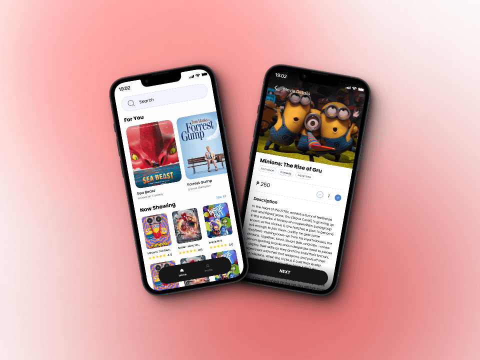
Tickit
Adobe XD, Mobile App
Designed a user-friendly app that makes it simple for moviegoers to order movie snacks, book seats, and buy tickets.